Introducing the New FluidRay.com
You might have noticed that things have been quiet on the site for the last few weeks. That’s because we’ve been working around the clock to get the new FluidRay.com up and running.
We’re proud to introduce to the new, more visual, mobile-friendly site. It’s taken the team several weeks (with a lot of long nights) to get it live.
Why Build a New Site?
We built the original site with a focus on delivering the software. Things like design and user-experience weren’t top of mind, and we didn’t spend a lot of time on how the site looked or how people would navigate. Yes, that was a big mistake.
Having had the site up for about a year, we were able to look at our site analytics and see some issues. We also realized that the site didn’t really match up to the software we’d built: 3D rendering is all about the visuals, so we need a site with the same emphasis.
We also thought about things like file management, caching, publishing tools, checkout and ease of maintenance — all the things that go into a keeping a site fresh, secure and growing.
What You’ll See on The New Site?
We’re still adding content and improving the visuals, but you’ll notice a few things right away:
- More visual: The old site had a lot of links and a lot text, but you only saw renders in the Gallery. With the new site, we’ve integrated beautiful renders, and video into every page. The design is meant to showcase what you can down with FluidRay RT.
- More organized: We’d compiled a lot of information (specs, tutorials, videos), but hadn’t done a good job of making it accessible. With the new site, we’ve made it easier to navigate through the information and to understand it. One of my personal favorites is the new layout for the Technical Specs page:
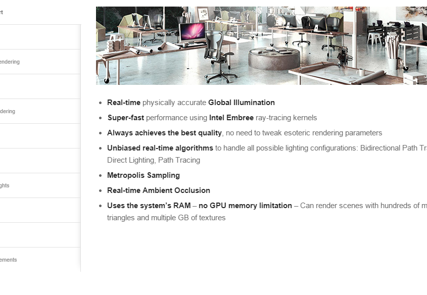
We took a lot of information, grouped it logically and then created a better way to navigate through instead of scrolling. This is something we’ll continue to work on, so that people don’t get distracted or dissuaded by the site content. - More interactive: You’ll notice more actions and animations throughout the site. We’ve tried to find a balance between useful actions and flare, but across the board you’ll find that navigating and learning takes advantage of motion and click actions.
- Less Linear: This one is a little tricky. We know that people don’t just start on the homepage of a site and follow every link. They jump around based on their interest and needs. But the old site was really only designed for top-down navigating. With the new site, you’ll notice that the top navigation stays with you as you scroll and that there are links to the trial version and other points of interest sprinkled through the pages. Our goal is to let you keep moving intuitively through the site, and not end up feeling like you hit a deadend.
What’s Next for The Site?
We don’t plan to ever be “done” with the new site. In the next few weeks, you’ll see new content including updated/upgraded renderings, improved videos and articles written by experience designers. We’re also working on a new shopping cart…and a few goodies that I can’t talk about yet.
Our goal is to keep making the site more useful to existing customers, demo users , designers, enthusiasts and anyone else visiting us.
It’s Always a Work in Progress
We think the new site is a HUGE leap forward from what we had before. And we’re confident that we’re on the right track. But there is still a lot to do and we have to make sure we aren’t falling behind the needs of our customers or the opportunities of web tech.
We hope you like the new site and that you’ll tell us if you don’t. Please leave a comment or visit the forums to tell us what you think about the new design and functionality.
Happy Rendering!